

In Living Color: The Tints and Tones to Update Your Home for Fall
Color is one of the easiest, most affordable ways to add new life, new looks, and new emotion into your home.
What’s your favorite color? That’s a question we’ve all been asked — and the good news is there’s no wrong answer. That same rule applies when bringing in the colors you love to your rooms and spaces.
The better news? Color is one of the easiest, most affordable ways to add new life, new looks, and new emotion into your home.
With the fall season almost upon us, it’s a great time to think about color and get inspired by the looks of nature and how you can play with new color ideas to freshen up for fall.
Cozy and Calm Coloring
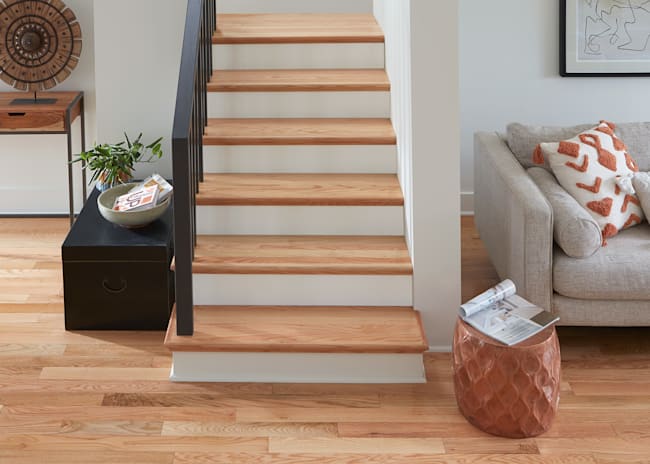
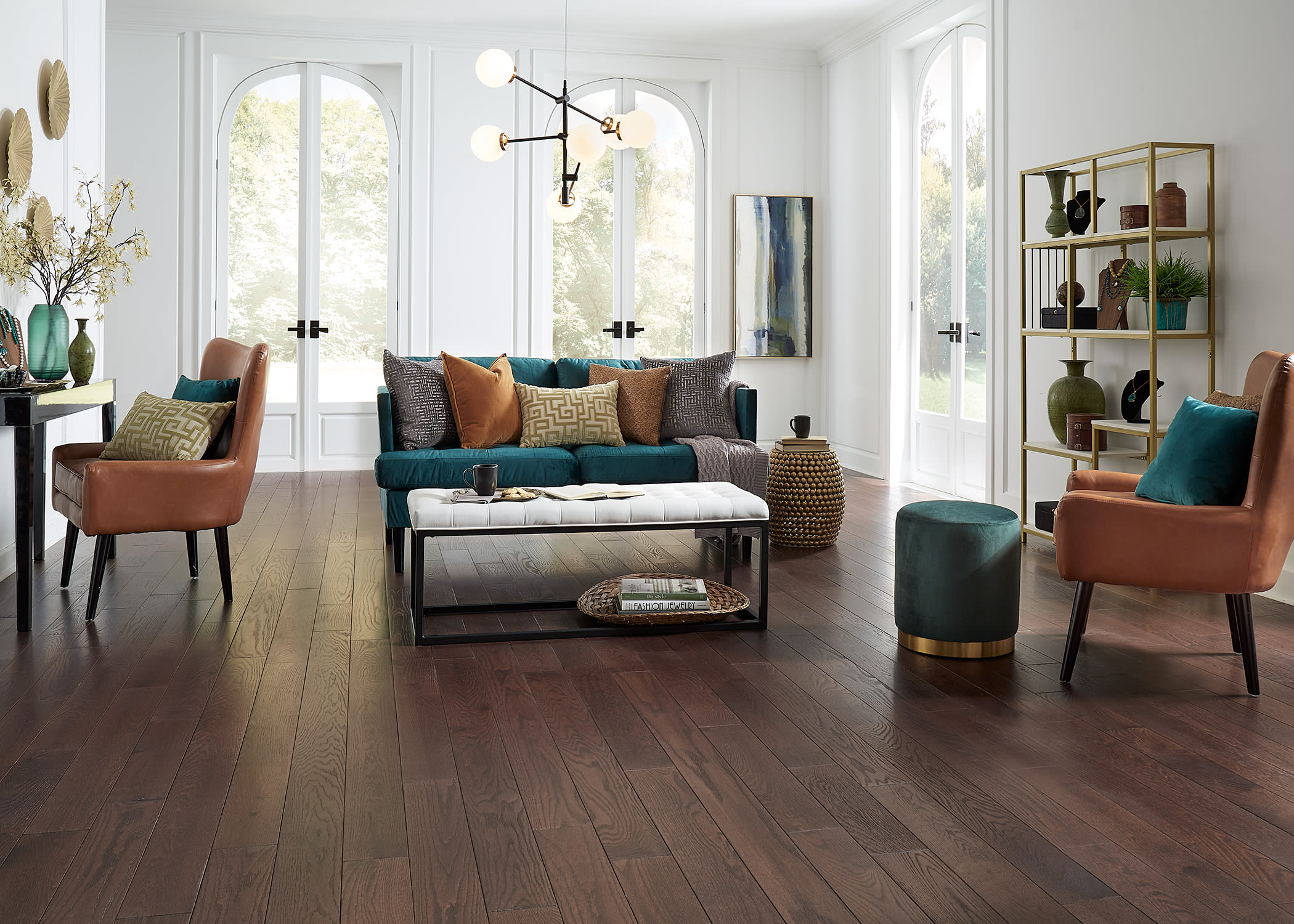
Cooler air is coming and with this change in temperature comes an opportunity to bring warmth to the home— but you don’t need to reach for the thermostat. In fact, the right colors can naturally bring a warmer and calmer feel. One path is to infuse muted, neutral tones or clean whites. And, look to cool greens as well, which are a constant to reconnecting with nature. For example, beautiful deep jewel tones are a great green addition to your fall decorating that also bring luxe and luster when incorporated through lampshades, throws, pillows and furniture. Such bold pops of color can complement and add interest to rooms styled in the warmth of creams, stone and linen tones, and softer hues.
“During these times, the emotional desire for comfort will continue to be a big driver of interior products and colors,”
says Katie Allen, director of trend and design for LL Flooring.
On-Trend Tones
The turning of the leaves also lends to natural color extensions for the home. Popular color trends include sunbaked oranges that are great to showcase in kitchens across backsplashes and cabinets and instantly add warmth and comfort. These bold oranges play nicely with layered browns — from natural wood tones to lived-in leather looks — that can be presented in any room and even look great in bedrooms. Browns are of course especially pronounced on the floor and some of our favorite wood-toned floors are Hunters Creek Hickory and Stratford Oak hardwood by Bellawood Artisan.

Mix and Un-Match
Now is also a time to take colors and turn them loose to let patterns and colors clash. This concept can create a sense of joy and fun to add more life to a room when the weather turns gray.
One idea is to mix heritage patterns like art deco geometrics or whimsical floral fabrics —or grandmotherly like quilts — with clashes of unsuspecting colors.
“When things feel unstable, people look to the past for reassurance, so familiar retro styles and colors give a sense of comfort plus an opportunity for personalization,”
says Allen.
So what’s your favorite color and how do you plan to let it live in the fall? We would love to hear your ideas!